By Ramsha Irfan on Apr 03, 2023
PepsiCo, one of the world's largest food and beverage companies, recently unveiled a new logo for its flagship soda brand, Pepsi. This marks the first logo change for the company in 15 years. Pepsi's iconic logo has undergone numerous changes over the years, with the latest design emphasizing a modern and minimalistic approach. The company's branding and logo play a crucial role in the perception of its products, making it essential for Pepsi to keep up with changing trends and consumer preferences.
This article explores the new Pepsi logo, its design, the reasons behind the change, and its potential impact on the brand's recognition and sales.
PEPSI Company is always picky when choosing logo design services to get a unique logo. So, with time, they continuously change their logo after every decade.
![]()
Originally, the logo featured a script font with red and blue swirls surrounding the word "Pepsi-Cola". Art nouveau style was popular in the early 20th century and can be seen in this logo.
![]()
A new logo with the word "Pepsi" centered on a bottle cap was introduced by Pepsi in 1940. To make the logo more memorable and modern, it was designed with a modern look.
![]()
A red, white, and blue swirl appeared on Pepsi's logo in 1950. Over a decade was spent using a logo that reflected the patriotic sentiments of the time.
![]()
Pepsi introduced a new logo in 1962 featuring a stylized blue and red wave with a white dot at the center. Until 1973, this logo looked like a smile.
![]()
Pepsi launched its new logo by introducing a stylized wave and a red, white, and blue sphere in 1973. This logo was designed to be more modern and was used for almost two decades.
![]()
The wordmark "Pepsi" in blue capital letters was added to the company's logo in 1991. This logo version was utilized for twelve years.
![]()
A stylized red, white, and blue globe with a more minimalist design was introduced as the new Pepsi logo in 2003. This logo is intended to be more contemporary and reflect Pepsi's commitment to sustainability.
![]()
In 2008, Pepsi paid over $1 million to Arnell Group for a drastic logo change. With a vision for a more simplistic design in the age of digital branding, everything was flattened and simplified, including the iconic Pepsi wave, which was reflected in the letter "e" of the new "Pepsi Light" font.
The symmetrical waves of the globe were replaced with a more edgy design, which received criticism for being cheap and soulless. Nonetheless, Pepsi remained steadfast in its rebranding decision.
![]()
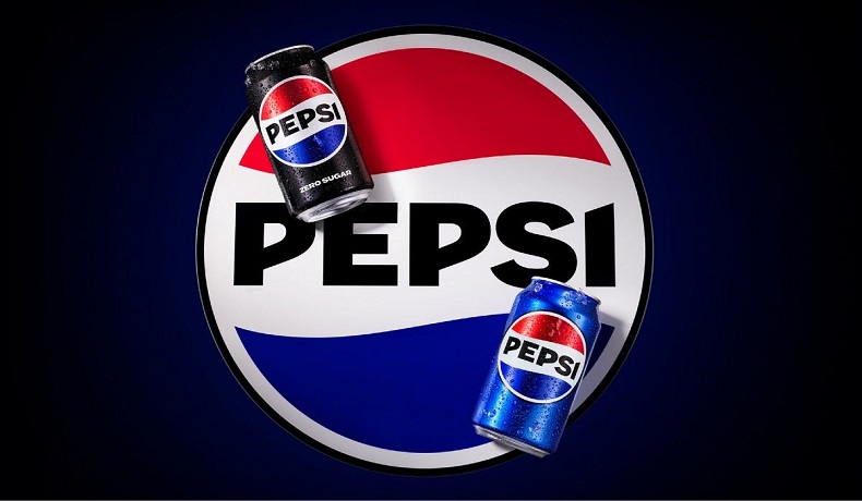
In the past few weeks, PEPSI has hired some of the best food logo design services to create a new name for the company that is both unique and up-to-date. On Tuesday, Pepsi showed off its new design and brand identity for North America. By the end of next year, it will be used all over the world. With a new style, color, and border, it looks a lot like the version from the 1990s, which people still remember.
PepsiCo will put the new branding on black and blue cans in the US and Canada starting this fall. By 2024, the new image will be used all over the world by PepsiCo.
Consumers and people who work in the business have had different reactions to the new Pepsi logo. Some people have complained that the minimalist style is too simple. But it's too soon to say what the new logo will do to Pepsi's brand personality and sales in the long run.
On the one hand, the new logo might help Pepsi stand out from its rivals and appeal to younger people who like things that are simple and modern. The simpler design makes it easier for people to remember and know the brand, which leads to more sales.
Conversely, the new logo may not resonate with Pepsi aficionados who have grown accustomed to the traditional logo design. In addition, the design's simplicity may convey a different sense of exhilaration or vitality than previous Pepsi logos, potentially affecting the brand's overall image.
Ramsha is a talented writer known for top-quality content on trending topics. Her excellence in research enables her to add value to businesses by driving online traffic with engaging and persuasive content.