By Robert Kevin modified Jul 29, 2025
~ 2 minutes to read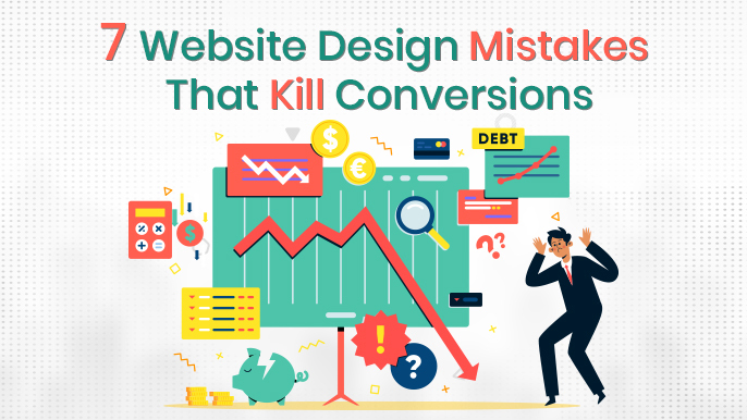
If you're a tech startup, SMB, or scaling digital business planning a new website or revamping an existing one, you’re probably focused on performance, lead generation, and conversion rate uplift. But here’s the kicker—your design decisions may be silently killing conversions.
Modern website design isn’t just about aesthetics or branding. It’s about how web UX matches search behavior, mobile-first expectations, and conversion triggers.
Buyers are turning more impulsive and intuitive; they don’t just expect sleek UI but a site that’s fast, frictionless, and trustworthy. And so does Google. With Core Web Vitals, mobile usability factors, and accessibility benchmarks influencing rankings and revenue alike, UX isn't optional—it’s your bottom line.
This guide unpacks:
No fluff. No vague advice. Just a high-clarity breakdown of how to design a website that works—for both users and search engines.
Let’s cut to the chase: UX is the hidden engine behind conversions. If your bounce rates are high, your session durations are low, or users seem to abandon mid-funnel, odds are you have a UX problem—not just a content or product issue.
Here’s what we know:
We, as digital users, have beaten Goldfish with the shortest attention span, and hence we form a first impression of a website in less than 50 milliseconds. Even faster than the blink of an eye.
If your layout, font, or design feels off—even slightly—you’ve already lost trust before your copy kicks in. That’s how UX directly impacts bounce rates and engagement.
Clunky navigation, poor form UX, and inconsistent microinteractions create friction at every stage of the funnel. Whether it's an enterprise landing page or a B2B SaaS demo request, even small design flaws can create massive drop-offs in goal completions.
Google’s Core Web Vitals framework evaluates how your site performs in real user conditions:
If you fail these metrics, Google will deprioritize your site in SERPs even with great content and information.
Your site architecture isn't just for users—it’s critical for crawlers. A confusing hierarchy, poor internal linking, or scattered menu logic makes it harder for bots to understand your content, and harder for humans to convert.
A bad UX often masks itself as a traffic problem when in reality it’s a structural failure in how users and bots experience your site.
Related Read: Web Design Trends
Fix What’s Costing You Conversions
Struggling with high bounce rates or form drop-offs? Our UX consultants pinpoint what’s wrong and deliver actionable solutions that lift real results.
Book a Free UX Audit
Most websites don’t suffer from one huge design flaw. They suffer from a cluster of smaller UX mistakes that compound over time. Below are the seven most conversion-killing website design mistakes—and exactly how to fix them.
The Mistake: Overloaded Menus, Shallow Architecture, No Hierarchy.
Ever visited a site that feels like a diner menu—20+ options with no clear logic? That’s a navigation failure.
Users don’t want to hunt. They want paths.
When your site structure lacks hierarchy or intuitive flow, it creates decision fatigue. According to Webstacks, sites with poor nav UX lose nearly 30% more conversions than their streamlined counterparts.
Common red flags:
The Fix: Architect With Purpose
The Mistake: Heavy Assets, Bloated Code, Uncompressed Files
Speed isn't just technical—it's emotional.
Users equate slow load times with poor quality. Even a 1‑second delay can reduce conversions by 7%, and anything beyond 3 seconds risks a 40% bounce rate.
From unoptimized images to excessive third-party scripts, most speed issues are self-inflicted.
The Fix: Optimize Everything
Every millisecond of delay adds cumulative friction, especially on mobile. Speed is foundational to your perfect website UX strategy.
The Mistake: Desktop-First Design Thinking
Mobile traffic dominates—period. If your website isn’t mobile-first, it’s probably bleeding conversions.
Data from DashClicks and Webstacks confirms that more than 50% of users engage via mobile—and yet many SMBs still treat mobile as an afterthought.
Common issues:
The Fix: Design Mobile-First, Not Mobile-Friendly
Poor mobile UX isn’t just a design issue; it’s a conversion killer and ranking risk.
The Mistake: Trying to Say Everything, Everywhere, All At Once
When everything screams for attention, nothing gets noticed. A cluttered interface with multiple fonts, colors, oversized hero sections, and scattered CTAs doesn’t just look messy but overloads cognition and paralyzes decision-making.
This is known as the Paradox of Choice. Users are presented with too many options, but the likelihood of taking any action drops. Cluttered layouts increase bounce rates and reduce funnel velocity.
Common offenders:
The Fix: Ruthless Prioritization + Visual Hierarchy
A clean interface isn’t just a design aesthetic—it’s a conversion tactic. Streamlining your interface helps users act faster, reducing drop-off between intent and click.
The Mistake: CTAs That Are Invisible or Indifferent
Let’s be clear—if users don’t see a next step, they won’t take one.
CTAs that are buried in blocks of text, styled like secondary links, or placed too far below the fold are dead zones. Worse? CTAs that say things like "Learn More" or "Click Here" with no context.
Vague or poorly placed CTAs lead to as much as 70% lower conversion rates.
Then there's the copywriting trap:
Focusing on features instead of solving problems. Nobody buys "AI-powered automation". They buy "cutting hours off your onboarding process".
The Fix: Strong, Intent-Led Copy + Bold CTAs
According to Nulab, improving CTA clarity and visibility alone can lift conversions by 200%+ in SaaS and service-based websites.
Build a High-Performance User Journey
Whether you're redesigning or optimising, our UX experts craft frictionless journeys that reduce churn and increase conversions across devices.
Get Your UX Plan Now
The Mistake: No Proof = No Conversion
Trust is the currency of the internet. Without it, no one buys, books, or subscribes.
Your site might look great, but if it lacks validation, identity, or transparency, users won’t feel confident enough to act. The absence of trust signals kills website conversion potential, especially for new or lesser-known brands.
Symptoms:
The Fix: Strategic Trust Layering
Embed real-time trust nudges like “20 startups booked a demo this week” or “Last updated July 2025” to build relevance and recency.
The Mistake: Flying Blind
Too many businesses launch a site and then guess what works. No analytics. No testing. No feedback loops.
Worse yet, some completely overlook accessibility—not realising that it’s a ranking factor, a legal requirement in many regions, and an essential layer of UX for real users.
This mistake becomes a silent killer over time. You can’t fix what you can’t measure. Sites without structured analytics and testing strategies see slower growth and poorer retention.
The Fix: Measure, Iterate, Include
Sites that bake in analytics + accessibility early don’t just convert better—they scale smarter.
Related Read: When to Redesign a Website?
Build smarter, not blindly. This framework helps you audit real user behavior, diagnose UX bottlenecks, and prioritize high-impact fixes that drive measurable conversions.
Start with a UX baseline using tools like Lighthouse, GTmetrix, and WebPageTest to assess Core Web Vitals. Poor LCP or FID scores signal rendering delays or interaction lag. Next, review user behavior on Hotjar or Clarity to capture heatmaps and click zones. Watch for rage clicks, scroll drop-offs, or ignored CTAs.
Device testing is equally critical at this stage. Verify breakpoints across real mobile devices. Pay attention to layout shifts, form field visibility, and tap accuracy. Document these findings in an audit matrix categorized by issue severity and journey phase.
An extensive audit report gives visibility and prioritization logic for agile remediation. An audit like this forms the objective base for redesign decisions and suggests solid, conversion-driven fixes.
Effective UX aligns to user intent at each phase of the buyer journey. Segment key funnels into Awareness, Evaluation, and Conversion stages.
At Awareness, visitors may enter through blogs or PPC landing pages. Your goal here is clarity and relevance. In Evaluation, users are comparing, reading, and assessing—pricing pages, case studies, and FAQs must be well-structured and scannable. Conversion involves forms, checkouts, and bookings—friction must be minimal and trust signals high.
Every stage should feature unique content types and UX elements tailored to that context. Mapping the journey this way helps avoid generic design and build a layout, CTAs, and copy that match user expectations. It also allows analytics tagging and heatmaps to surface drop-offs more meaningfully across the full funnel.
With your funnel mapped, connect UX failures to key drop-off points. For example, high bounce on top-funnel content often signals layout noise, poor load times, or unclear messaging.
If visitors abandon pricing or product pages, investigate CTA visibility, layout complexity, or missing trust markers. At the conversion stage, form abandonment typically reflects poor mobile usability, long fields, or no inline validation.
Use Google Analytics (GA4), Hotjar, and funnel tools to track patterns and overlay session replays upon them to see real user behavior. This process helps diagnose where drop-offs occur and why. Each issue should then be ranked by user intent stage and fix high-leverage friction points that directly affect conversions and revenue.
Not every problem carries the same weight. Initially, address UX issues impacting pages with high traffic and significant revenue. Frequent high-impact areas to address consist of sluggish homepages, unclear navigation, non-working mobile CTAs, and multi-step forms lacking progress indicators.
Utilize a prioritization matrix, like assessing by effect, occurrence, and development effort, to pinpoint easy wins. For instance, streamlining the navigation layout or optimizing above-the-fold images results in immediate performance improvements.
Even minor adjustments such as relocating CTAs or minimizing form fields significantly increase conversions. Steer clear of the mistake of prioritizing aesthetics initially. Rather, address friction that hinders intent on pages with a distinct user goal, such as pricing, lead generation, or registration. It will connect UX improvements to quantifiable business results, rather than just superficial aesthetic alterations.
Fixes alone don’t scale unless you measure and optimize. Every key UX decision should be tested through structured A/B experiments.
Tools like Google Optimize or VWO allow you to test CTA variations, layout shifts, copy changes, and form flows. Each test should start with a hypothesis based on your UX audit—e.g., “Users convert better with a sticky mobile CTA than with a footer CTA.” Run tests until they reach statistical confidence and segment results by device or referral channel.
For lean teams, session recordings or heatmaps offer lower-lift alternatives to formal testing. Make iteration continuous—retesting every quarter helps adjust UX as user behavior evolves. This approach transforms your site from a static asset into a performance-optimised conversion engine.
Related Read: Why Custom Web Design Performs Better?
Go beyond fixing mistakes. These expert-backed UX tactics—from mobile-first design to form optimization—transform your site into a conversion-focused performance engine.
Mobile-first design forces simplicity and prioritization. Begin your UX planning with mobile wireframes—optimizing tap zones, scroll behavior, and linear content flow. Don’t rely on responsive resizing from desktop designs. Instead, use tools like Figma to prototype for small screens directly. Test with real users using Maze or UserTesting.com.
Look for thumb-reach issues, misaligned buttons, and broken interactions in actual use—not just in design previews. Small frustrations on mobile compound quickly and lead to early exits. Even enterprise buyers now browse demos, pricing, and case studies via mobile, so if your layout or CTAs don’t work intuitively, you’re losing qualified leads. Mobile-first isn’t just about responsiveness—it’s about designing for the smallest, fastest, and most distracted attention spans first.
Strong internal search experience improves engagement and conversion, especially for larger content or product-driven websites. Start by ensuring the search bar is prominent and available across all pages—don’t bury it in menus or hide it behind icons. Implement real-time auto-suggestions and typo tolerance to catch more user queries. When results load, show previews or thumbnails for easier scanning. Refine results with filters like category, tag, price range, or date to support better decision-making.
Many users, especially return visitors, prefer search over navigation, especially when looking for something specific. Poor search UX leads to frustration and early exits. Invest in a robust on-site search solution like Algolia or Elasticsearch that delivers speed, accuracy, and semantic relevance to guide conversions.
Every extra field in a form introduces friction. Keep primary forms—like sign-ups or demo requests—to 3–5 fields maximum. Collect additional data later using progressive profiling if needed. Use inline field validation so users can correct mistakes in real time without starting over. For mobile, make sure input types match the expected data—use tel for phone numbers, email for email fields, and enable auto-fill where possible.
Forms should be single-column and responsive, with clear progress indicators for multi-step flows. Long, poorly structured forms kill lead generation efforts, especially for users in intent-ready stages. A clean, fast, and forgiving form experience can increase completions by up to 30%, especially when supported by trust badges and smart copy.
Readable typography is foundational to conversion-ready UX. Stick to 16px or larger for body text and increase slightly for mobile screens. Maintain a line height of 1.5 and a line length of 50–75 characters to ensure comfortable scanning. Avoid decorative or condensed fonts for core messaging—stick with legible, professional typefaces.
Use bolds and contrast to draw attention to key messages, but don’t overdo color changes or font variations. Ensure contrast ratios meet WCAG 2.2 guidelines—especially for users with visual impairments. Typography that forces effort—like grey text on white, small fonts, or tight spacing—undermines content quality and increases bounce rates. Great UX design doesn’t start with color palettes or layout—it starts with making the copy readable and scannable.
Optimising UX for SEO starts with semantic structure. Use clean HTML tags like <section>, <nav>, and <main> to help search engines understand content hierarchy. Ensure every page has one <h1>, followed by properly nested subheadings. This isn’t just for bots—it improves accessibility and user scanning.
Use metadata (titles, meta descriptions, and OG tags) to clarify content purpose. Image alt text and structured schema markup (product, review, article, FAQ) help surface your content in featured snippets and rich results. Avoid deep navigation or isolated orphan pages—keep content no more than three clicks from the homepage. A crawlable, indexable, and logically structured site isn’t just good for rankings—it increases discoverability, reduces bounce, and ultimately supports conversion-focused UX.
Don't Just Redesign—Outperform
We go beyond aesthetics to engineer UX that speaks to user intent, optimises behaviour paths, and supports scalable growth.
Start Your UX Transformation
Great design isn’t what wins awards—it’s what removes friction, builds trust, and makes conversions feel effortless.
Let’s recap the 7 website design mistakes that kill conversions:
Now you’ve got the roadmap to avoid these traps. But don’t just read it—use it.
Run a quick UX audit. Start small. Prioritize quick wins like speed, CTA clarity, and mobile touch fixes. Then expand to structure, trust-building, and analytics feedback loops.
Ideally under 2.5 seconds for LCP (Google's standard). Every second after that increases the bounce rate and reduces trust.
Keep the main navigation to 5–7 items max. Beyond that, use dropdowns or a megamenu with clear hierarchy.
One primary CTA per page or section. Supporting CTAs can exist, but don’t compete visually.
Yes. It improves usability for all users and ensures compliance with legal standards like WCAG 2.2. It also enhances mobile UX and SEO.
If every section doesn't drive a specific action or remove buyer hesitation, it’s too much. Aim for focused copy + visual cues.
If your site has grown organically and now feels disconnected—or has >30 pages with no logical grouping—it’s time for a nav overhaul.
Robert Kevin is a versatile content writer known for captivating storytelling and impactful writing. His well-researched articles and compelling blog posts leave a lasting impression on readers.